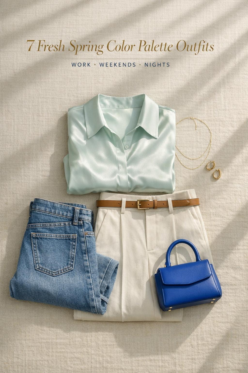
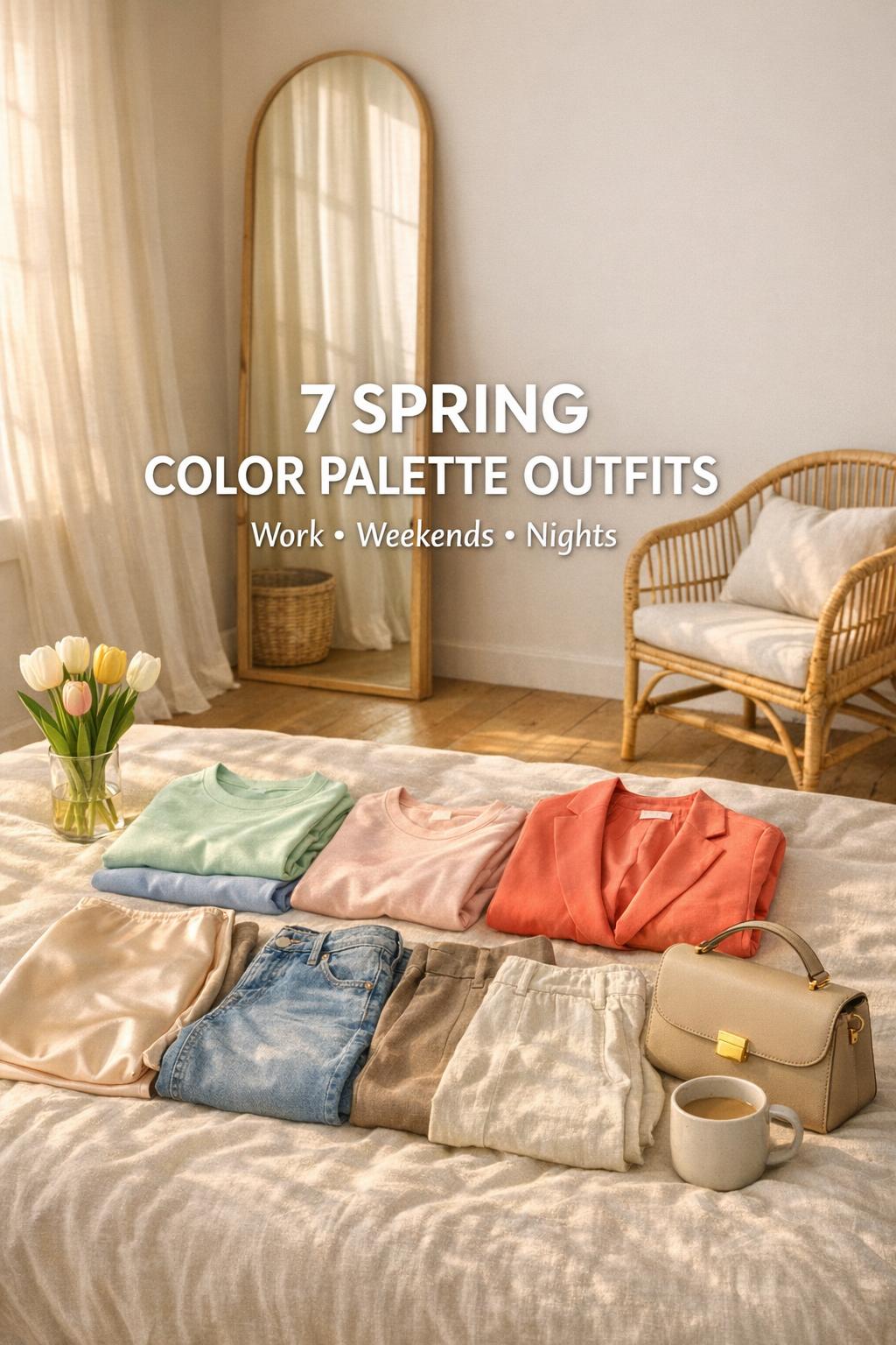
7 Fresh Spring Color Palette Outfits for Work, Weekends & Nights
This post may contain affiliate links. As an Amazon Associate, we earn from qualifying purchases.
Spring color palettes can instantly refresh your outfits — but choosing the right colors is only part of the equation. What really matters is how those colors are combined and where you wear them.
This guide focuses on how to build outfits using spring color palettes in real-life situations — from workdays to weekends and evenings — so your outfits feel intentional, not random.
Why Color Palettes Matter More Than Individual Pieces
Most outfits don’t fail because of the clothes themselves — they fail because the colors don’t work together. A well-balanced color palette can make even simple pieces look elevated.
Your wedding style is personal.
Your plan should feel that way, too.
Zarellea keeps your guest list, budget, vendors, and every next step beautifully organized — so you can focus on the moments that feel like you.
- ✔ Too many unrelated colors → outfit feels chaotic
- ✔ Too much of one tone → outfit feels flat
- ✔ Balanced palette → outfit feels cohesive and intentional
-
 $44.99Shop this look
- Coat is nice for spring and fall.
- Great jacket with large sewn-in hat to protect head from rain.
- Great quality.
This is an affiliate link. We may earn a small commission at no extra cost to you.
07/17/2026 03:01 pm GMT -
 $43.12Shop this look
- Great looking.
- Great quality & true to size fit.
- Very comfortable.
This is an affiliate link. We may earn a small commission at no extra cost to you.
07/17/2026 04:01 pm GMT -

$66.00$48.88Shop this look- Attractive and well made.
- This is a fantastic bag - well constructed, good travel size, really well thought out safety features.
- The material is a strong canvas type and it has excellent anti-thief profile.
This is an affiliate link. We may earn a small commission at no extra cost to you.
07/17/2026 04:01 pm GMT -

$24.99$19.99Shop this look- Cute and comfortable.
- Beautiful color and material.
- Gorgeous, flattering skirt.
This is an affiliate link. We may earn a small commission at no extra cost to you.
07/17/2026 02:01 pm GMT -
 $16.99Shop this look
- Well-made, very attractive, extremely comfortable.
- Beautiful slim fit long sleeve shirt.
- Nice stretchy material.
This is an affiliate link. We may earn a small commission at no extra cost to you.
07/17/2026 02:01 pm GMT -
 $39.99Shop this look
- The quality is great.
- Great dress for summer.
- Nice, cool breezey dress.
This is an affiliate link. We may earn a small commission at no extra cost to you.
07/17/2026 02:01 pm GMT
Understanding Spring Color Palettes
What makes a spring palette unique (clarity, brightness, and “freshness”)
Spring palettes tend to read as clear, bright, and light-reflective—colors that feel energized in natural daylight. In practice, that can mean soft pastels that look clean (not dusty), crisp brights that feel playful (not heavy), and warm-leaning hues that resemble sunlight on fabric. Many spring wardrobes succeed because they balance “fresh color” with grounding neutrals like cream, taupe, and sand, keeping the overall effect wearable.
A helpful way to think about spring color theory is through value and clarity: lighter values often feel more “spring,” and clearer tones (rather than overly muted ones) keep outfits from looking flat. That doesn’t mean you can’t wear deeper shades—runway-inspired spring color trends often mix jewel tones with pastels—but it does mean you’ll want to control how many intense colors you wear at once.
Pastel vs. bold spring colors: how to choose the right intensity
Many people think spring equals pastel, but spring outfits can also include bold, vivid hues—especially when styled with restraint. Pastels are a natural entry point because they’re easy to combine with neutrals, while brights often look best when you treat them as a “hero color” and keep the rest of the outfit simple.
- If you want an effortless look: start with soft pastels and light neutrals.
- If you want a trend-forward look: use one bright or candy-like shade with denim or cream.
- If you want a polished look: try a monochrome spring tone (one color family head-to-toe) and vary texture.
- If you want a dramatic look without heaviness: mix a jewel tone with a fresh pastel, then ground it with a neutral.
How to determine your undertone (warm, cool, or neutral) for spring palettes
Spring palettes can be adapted for warm, cool, and neutral undertones. The goal isn’t to restrict you—it’s to make color choices feel more harmonious so you can repeat outfit formulas without second-guessing. Warm undertones often pair easily with peachy and sunny hues, cool undertones often shine in soft blues and lavender, and neutral undertones can flex across both by adjusting intensity (light/clear vs. slightly warmer/softer).
If you’ve tried spring colors and felt “washed out” or “overpowered,” it’s often an issue of value and clarity rather than the entire palette being wrong. A lighter, clearer version of a color can feel more spring-appropriate, while adding a neutral base (cream, taupe, sand) can make even a bold shade easier to wear.
The 3-Color Rule for Effortless Outfits
If you want your outfit to look cohesive without overthinking, stick to three colors:
- Main color (dominant piece)
- Secondary color (supporting layer)
- Accent color (small detail — bag, shoes, or top)
This creates visual balance without making the outfit feel busy.
How to Adjust Color Palettes for Different Situations
For Work
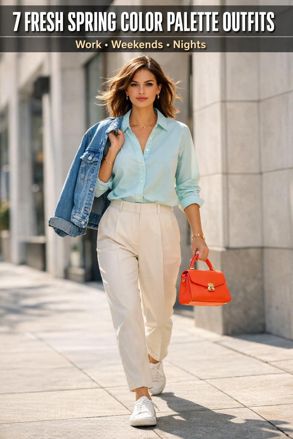
Stick to softer contrasts and neutral bases. Light beige, soft blue, and muted tones create a professional but fresh look.
For Weekends
You can introduce more contrast and relaxed combinations — denim with brighter tones or soft pastels.
For Evenings
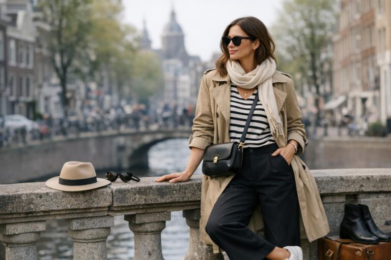
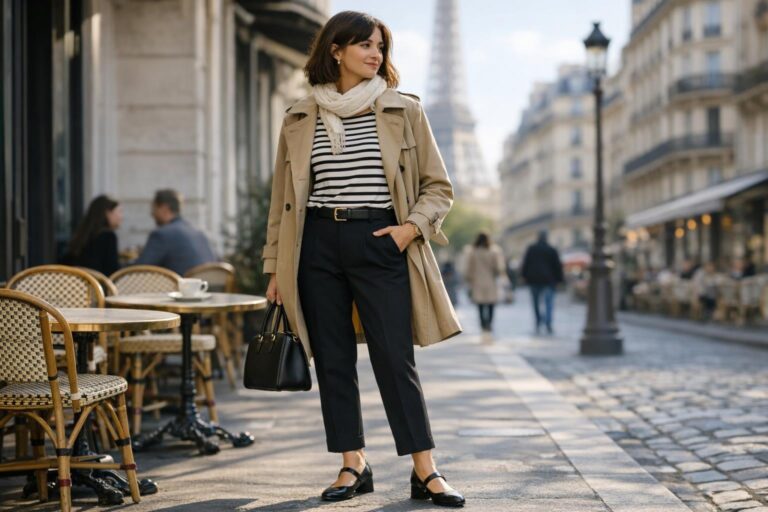
Go deeper or more defined — darker tones, sharper contrasts, or monochrome looks with one strong accent.
Spring Palettes by Undertone
Use the undertone categories below as flexible guides. You don’t need to fit perfectly into one box; many wardrobes work best when you pick a “home base” palette and borrow a few accent shades from a neighboring one.
Light & Clear Spring (pastels and crisp brights)
Light & Clear Spring is the classic “fresh and airy” direction: clean pastels paired with crisp brights, anchored by light neutrals. It’s ideal if you like minimalist spring color palette outfits, monochrome spring looks, and easy daytime combinations that feel bright without being loud.
- Color families to prioritize: soft pastels, clear brights, light neutrals (cream, sand).
- Best overall effect: light, clean, modern.
- Easy pairing strategy: one pastel + one neutral, or one bright + two neutrals.
Warm Spring (peachy, sunny hues)
Warm Spring leans into peachy and sunny color stories—think warm, optimistic tones that feel natural in bright daylight. This palette shines when you want a cheerful look that still feels polished, especially when you build outfits around warm neutrals and add a single “sunny” statement color.
Warm Spring also supports that runway-to-wardrobe idea of pairing expressive colors with clean silhouettes. When the shape is simple, the warmth reads intentional rather than costume-like.
Cool Spring (soft blues, mint, lavender)
Cool Spring is a softer, cooler take on spring color trends: gentle blues, minty greens, and lavender-style pastels that still feel clear rather than dusty. If you love calm color but want it to feel seasonal (not wintery), this palette makes it easy—especially when you use cream and taupe as your base neutrals instead of going overly dark.
- Color families to prioritize: soft blues, mint, lavender, light neutrals.
- Best overall effect: fresh, serene, understated.
- Easy pairing strategy: monochrome within one cool color family, then add one neutral.
Capsule Wardrobe Framework: Build Repeatable Spring Color Palette Outfits
A capsule approach is the fastest way to make spring color palette outfits feel cohesive. Instead of buying random “spring colors,” you choose a small set of neutrals plus a handful of coordinated spring shades, then remix them into outfits for casual days, workwear, and evenings. This is also the easiest way to keep your wardrobe aligned with spring color trends without constantly shopping.
Start with core neutrals: cream, taupe, and sand
Most wearable spring wardrobes rely on light neutrals to keep colors looking fresh. Cream, taupe, and sand work as soft anchors that let pastels look cleaner and brights look more deliberate. They also support minimalist styling: clean silhouettes, restrained palettes, and neutrals with pops of color.
Tip: If you love color but feel unsure wearing it head-to-toe, upgrade your neutral base first. When your neutrals coordinate, adding one spring shade instantly looks like a “planned outfit.”
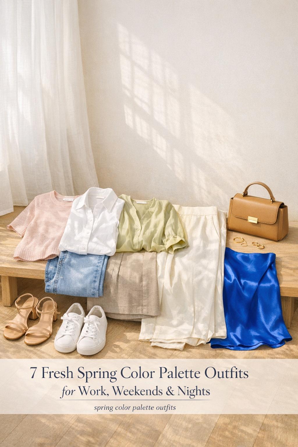
Palette A: Pastel top + neutral bottom (10 outfit ideas)
Use this set when you want soft spring color palette outfits that are easy to repeat. The formula is simple: pastel near the face, neutral on the bottom, then one small accent (shoes, bag, or jewelry) that stays within your palette.
- Pastel top + cream trousers + neutral shoes
- Pastel knit + taupe skirt + tonal accessories
- Pastel blouse + sand chinos + minimal jewelry
- Pastel tee + cream denim + light outerwear
- Pastel button-up + taupe trousers + structured bag
- Pastel tank + sand midi skirt + light layers
- Pastel sweater + cream shorts + clean sneakers
- Pastel top + taupe denim + subtle accent color
- Pastel blouse + sand trousers + tonal belt
- Pastel monochrome (same family) + neutral third piece
Tips: Keep the pastel “clean” by pairing it with fabrics that hold color well, and keep the overall silhouette simple if you’re new to pastels. If you want more impact without adding more colors, add texture (a crisp cotton, a smooth satin, or a breathable linen) rather than another shade.
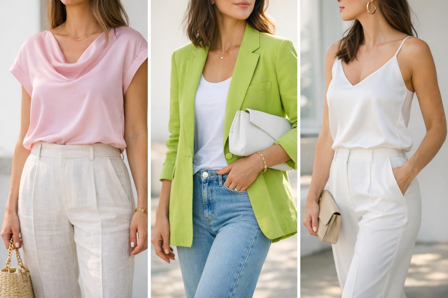
Palette B: Bold accent with neutrals (12 outfit ideas, including denim)
This palette is for the days you want spring color trends to show up clearly—tomato red, candy pink, lime chartreuse-style energy, airy blues—without losing wearability. The trick is to treat the bright as the hero color and keep everything else neutral or quietly tonal. This is also where denim becomes your best friend: it grounds bold colors and keeps the look casual.
- Bright top + classic jeans + neutral sneakers
- Bright blouse + light denim + cream outer layer
- Bright knit + jeans + understated bag
- Bright jacket + neutral top + jeans
- Bright skirt + cream tee + neutral flats
- Bright trousers + cream blouse + minimal accessories
- Bright dress + neutral shoes + neutral bag
- Bright top + taupe trousers + tonal belt
- Bright accessory pop + neutral outfit base
- Bright-on-denim with a neutral third piece (cardigan or blazer)
- Bright top + sand shorts + clean sandals
- Bright scarf or bag + monochrome neutral outfit
Tips: If you’re nervous about brights, start with a pop of color in accessories, then move up to a top, then a full hero piece like trousers or a dress. If you’re wearing brights with denim, keep your shoe and bag choices clean and simple so the color feels intentional rather than chaotic.
Palette C: Monochrome spring tone (8 outfit ideas)
A monochrome spring look can be one of the easiest ways to look elevated with minimal effort. “Monochrome” doesn’t have to mean identical shades; it can mean staying within one color family and varying value (lighter/darker) and texture (matte/shiny, structured/soft). This approach works especially well for minimalist spring color palette outfits.
- Head-to-toe pastel with one neutral accessory
- One color family in two values (lighter top, deeper bottom)
- Monochrome knit + matching trousers with different textures
- Monochrome dress + tonal outerwear
- Monochrome set + neutral shoes
- Monochrome blouse + skirt, then add a neutral belt
- Monochrome top + denim in a similar tonal direction
- Monochrome outfit + one bright micro-accent (bag or shoe)
Tip: Monochrome looks best when your fabrics do the “interesting” work. If the color is calm, choose at least one piece with a texture shift (linen vs. satin, or crisp cotton vs. soft knit) to keep the outfit looking styled.
Color Pairings, Textures, and Prints That Keep Outfits Cohesive
A simple pairing rule: one hero color, two supporting colors
If you want your outfits to look cohesive (not accidental), use a simple structure: one hero color (the main spring shade), plus two supporting colors (usually a neutral and a second quiet tone). This makes it easier to wear both pastels and bold spring hues without overloading your look.
Tip: When in doubt, make denim or cream your supporting “neutral” and keep your second supporting color subtle (taupe, sand, or a softer version of your hero shade). This is especially effective for “how to wear spring colors with jeans” outfits because denim naturally reduces visual intensity.
Texture tips: linen, cotton, and satin change how color reads
Spring colors can look different depending on fabric and finish. Breathable, matte textures can make color feel relaxed and daytime-friendly, while smoother, shinier textures can make the same color look brighter and more “evening.” This matters when you’re trying to keep a palette consistent across casual outfits and dressier occasions.
- Linen: often reads airy and casual, great for soft palettes and warm-weather transitions.
- Cotton: reads clean and classic, ideal for minimalist styling and crisp color blocking.
- Satin (or similarly smooth finishes): intensifies color and can make pastels look more luminous.
Tip: If a bright feels “too loud,” try it in a more matte texture; if a pastel feels “too quiet,” try it in a smoother texture or a cleaner silhouette.
Print coordination: keep patterns inside your palette
Prints are one of the easiest ways to mix multiple spring colors without looking mismatched—if the print already contains your neutrals and one or two of your seasonal shades. The key is not the print size; it’s whether the colors stay within your chosen spring direction (light/clear, warm, or cool).
Tip: When you wear a printed piece, pull one color from the print for a supporting item (like shoes or a bag). That single “echo” is a small styling move that makes spring color palette outfits look deliberate.
How to Fix an Outfit That Feels Off
- If the outfit feels chaotic → remove one color
- If it feels flat → add one contrasting element
- If it feels too strong → soften one tone with a neutral
Occasions and Style Personalities: Make Your Palette Work in Real Life
Spring color palette outfits should fit your schedule and your style personality, not just a trend forecast. Below are flexible ways to translate spring color trends into outfits that work for workwear, weekends, and evenings—then adapt them for different style directions like casual, classic, trendy, boho, and romantic.
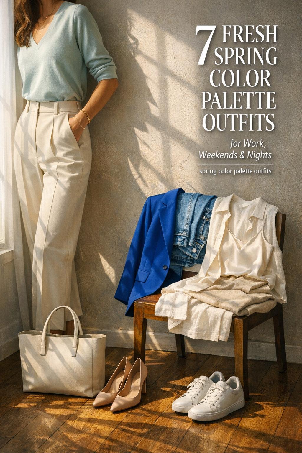
Workwear: polished color without feeling loud
For work, the easiest approach is “neutrals with a pop of color.” Use cream, taupe, or sand as the base, then add one spring shade in a structured piece (a top, a knit, or an outer layer). This keeps the look clean and professional while still feeling seasonal.
- Work formula 1: neutral base + one pastel near the face + minimal accessories
- Work formula 2: tonal monochrome + one neutral third piece
- Work formula 3: structured silhouette + one bright accent (kept to one item)
Tip: If your workplace leans conservative, choose softer hues and let texture do the work. A clean, simple shape with a spring color reads more refined than multiple bold items at once.
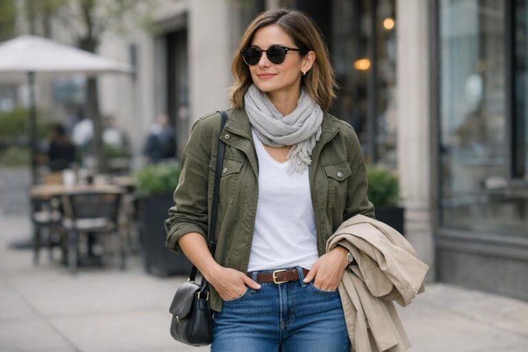
Weekend: denim-first outfits that still look “spring”
Weekends are where the “wear spring colors with jeans” approach shines. Denim gives you an instant neutral anchor, so you can experiment with candy-like brights, airy blues, or soft pastels without needing a complex outfit plan. If you want a little more direction, stick to one hero color on top and keep everything else quiet.
Tip: If you love casual outfits but want them to look styled, repeat a single supporting neutral (cream, sand, or taupe) across your shoes and bag. That small repetition makes even a bright top look cohesive with denim.
Evening: jewel tones and fresh pastels, balanced
For evening, spring doesn’t have to mean pale. One of the most compelling seasonal directions is pairing jewel tones with fresh pastels or light neutrals. The contrast feels intentional and “occasion-ready,” especially if you keep the silhouette clean and let the color pairing be the statement.
- Evening formula 1: jewel tone hero piece + neutral accessories
- Evening formula 2: jewel tone + fresh pastel accent + cream base
- Evening formula 3: monochrome spring tone + satin-like texture shift
Style personalities: casual, classic, trendy, boho, romantic
Your style personality affects which spring palette feels most “you.” Casual style often looks best with denim pairings and clean basics; classic style benefits from neutral bases and restrained pops of color; trendy style can push into bolder spring hues; boho style can lean into relaxed layering and texture; romantic style often shines in soft pastels and gentle monochrome.
Tip: If you’re building a cohesive wardrobe, choose one primary styling lane (like classic or casual) and then use color as the seasonal update. That prevents spring colors from feeling like a separate “costume” section of your closet.
Minimalist Spring Color Palette Outfits: A Practical Guide
If you love clean silhouettes and a calm closet, spring color trends are still available to you—without turning your wardrobe into a rainbow. Minimalist spring color palette outfits work best when you reduce the number of colors per look and rely on sharp coordination, not maximal contrast.
Monochrome spring looks (the minimalist shortcut)
Monochrome is a minimalist strategy that still reads fashion-forward. Choose one spring tone, keep the outfit within that family, and use a neutral to “frame” it (shoes, bag, or outer layer). This keeps the look sleek while still feeling seasonal.
Neutrals with pops of color (the everyday approach)
The simplest minimalist formula is a neutral base plus a single spring pop—often easiest with tops, lightweight layers, or accessories. This approach also makes shopping more efficient: you can keep your core wardrobe stable and refresh your look with a few well-chosen spring shades.
- Minimal pop idea: cream + taupe + one pastel
- Moderate pop idea: cream base + one bright + denim
- Max pop (still minimalist): monochrome bright, neutral accessories, clean silhouette
Shopping Guide: Build a Spring Wardrobe From Budget to Premium (Without Guesswork)
A smart spring refresh isn’t about buying the most pieces—it’s about buying the most cooperative pieces. Look for items that align with your chosen palette (light/clear, warm, or cool), work with your neutrals, and can be styled in at least three ways: with denim, with a neutral bottom, and as part of a monochrome or near-monochrome look.
Affordable staples (focus on color, not complexity)
At the affordable level, prioritize pieces where color does the heavy lifting: simple tops, easy layers, and accessories. Clean silhouettes support spring hues and look more intentional across more outfits.
- Simple tops in your chosen spring shades (pastel or bright)
- Light-neutral basics (cream, taupe, sand) to anchor color
- Denim as the everyday pairing tool for bold spring colors
- One or two accessories in a spring accent color for “pop” outfits
Mid-range pieces (invest in structure and repeatability)
In the mid-range, focus on pieces that help your outfits look polished: structured layers, better fabrics, and items that make color pairings feel grown-up. This is where a well-chosen third piece can transform a simple pastel-and-neutral combo into a work-ready look.
Tip: If you’re building a capsule, it’s often better to buy one excellent “bridge” layer (that works across multiple outfits) than several standalone bright pieces you can’t easily repeat.
Luxury accents and statement items (runway-to-wardrobe, simplified)
Luxury spring styling often showcases bold color pairings and refined textures. To translate that into real life, consider one statement item in a seasonal shade—especially if the silhouette is clean and the color is a true hero. Then keep the rest of your look restrained with neutrals and minimal accessories so the statement reads intentional.
How to Transition Spring Palettes Into Early Summer
Spring and early summer share a lot of the same color energy, which makes transition styling straightforward. The easiest shift is to keep your palette and change the “weight” of the outfit: lighter fabrics, simpler layers, and a slightly brighter overall impression.
Seasonal adjustments: lighter fabrics and simpler layering
As temperatures rise, keep your spring colors but reduce layering and let texture carry the look. Lighter fabrics can make colors appear fresher and more breathable, which supports the spring-to-summer handoff without changing your entire wardrobe.
Accessory accents for late spring and early summer
If you don’t want to buy more clothing, accessories are the simplest transition tool. A pop-of-color accessory can refresh your neutral base, and a small shift in accent color (from soft to brighter, or from warm to cooler) can keep outfits feeling seasonal while staying consistent with your overall palette strategy.
Tip: When transitioning, keep your neutrals consistent. It’s easier to evolve accent colors than to replace your base wardrobe.
Practical Tools You Can Create at Home (No Special Apps Needed)
You don’t need complicated systems to stay on palette. A few simple, repeatable tools can help you shop and get dressed faster while keeping your spring color palette outfits cohesive.
Create a mini color “swatch list” for your phone
Pick a short list of your best spring neutrals plus 5–7 seasonal colors (pastels, brights, or a mix). Keep it consistent for the season. When you shop, compare items to your list rather than deciding from scratch each time.
Build a printable capsule planner (simple grid)
On one page, list your neutrals (cream, taupe, sand, denim) and your chosen spring shades, then write 10–12 outfit formulas you can repeat (work, weekend, evening). The point is not perfection; it’s reducing decision fatigue so your wardrobe feels coordinated.
Use a “three-wear” rule before you buy a new color
Before adding a new spring shade, identify at least three outfits you can build with what you already own. If you can’t, the color may be trend-appealing but not capsule-friendly. This keeps your palette cohesive and prevents one-off pieces from taking over your closet.
Final Tips for Staying on Palette All Season
Consistency is what makes spring color palette outfits look elevated. When you repeat a few key neutrals, control intensity (pastel vs. bright), and use a simple pairing rule, your wardrobe starts to feel intentional even if you’re mixing old and new pieces.
Tip: Do quick “balance checks” before you leave the house. If you’re wearing a bold hero color, simplify everything else. If you’re wearing multiple soft colors, add one grounding neutral. If your outfit feels flat, change texture rather than adding another color.
Tip: If you want to remix what you already own, start by updating one category at a time—tops, then layers, then accessories. That gradual approach makes it easier to learn what you actually wear and which spring colors feel best on you.
Common Color Mistakes to Avoid
- Too many competing colors → outfit feels unstructured
- No neutral base → colors feel overwhelming
- Matching everything exactly → outfit feels flat
How do I know which spring palette suits me?
Start with undertone and intensity: warm undertones often suit peachy, sunny hues; cool undertones often suit soft blues, mint, and lavender; neutral undertones can borrow from both by choosing light and clear versions. If you feel washed out, adjust value and clarity (try lighter, cleaner tones) and add a neutral base like cream or taupe for balance.
What are the easiest spring color palette outfits to repeat?
The easiest repeatable formulas are pastel top + neutral bottom, bright hero piece + neutrals, and monochrome within one spring tone. These work because they limit the number of colors while still looking seasonal and styled.
How do I wear spring colors with jeans without looking too loud?
Use denim as the neutral anchor and keep spring color to one hero item (like a top or jacket), then repeat one quiet neutral (cream, taupe, or sand) in your shoes or bag. This keeps the outfit cohesive and lets the color read intentional rather than overwhelming.
Can I do minimalist spring color palette outfits if I usually wear neutrals?
Yes—use neutrals as your base and add one controlled pop of spring color, or choose a monochrome spring tone and keep the silhouette clean. Minimalist styling works best with restrained palettes, simple shapes, and texture shifts instead of multiple competing colors.
How do I mix jewel tones and pastels in spring outfits?
Treat the jewel tone as the hero and the pastel as a supporting accent, then ground the outfit with a light neutral like cream. Keeping the silhouette clean and limiting additional colors helps the pairing feel fresh and wearable.
What’s the simplest rule for color pairing in spring?
Use one hero color and two supporting colors, usually a neutral plus one softer or tonal shade. This approach keeps outfits from feeling chaotic and makes both pastels and brights easier to wear.
How can I make a pastel look more polished for workwear?
Pair one pastel item with structured, light neutrals and keep accessories minimal. A clean silhouette and a consistent neutral base make pastel read professional, while texture and layering can add refinement without adding more colors.
How do I transition spring colors into early summer?
Keep the same palette and lighten the outfit “weight” by simplifying layers and leaning into lighter fabrics. Use accessories for small accent shifts, and keep your core neutrals consistent so your wardrobe stays cohesive across seasons.
If you’re building full outfits beyond color planning, these spring outfit ideas can help you translate palettes into complete looks.